EbikeCityZen - Brand Refresh & Custom Shopify Theme Design
Timeline: Completed May 2025 | Partnership Type: Two-week intensive brand and website transformation project
Client Profile
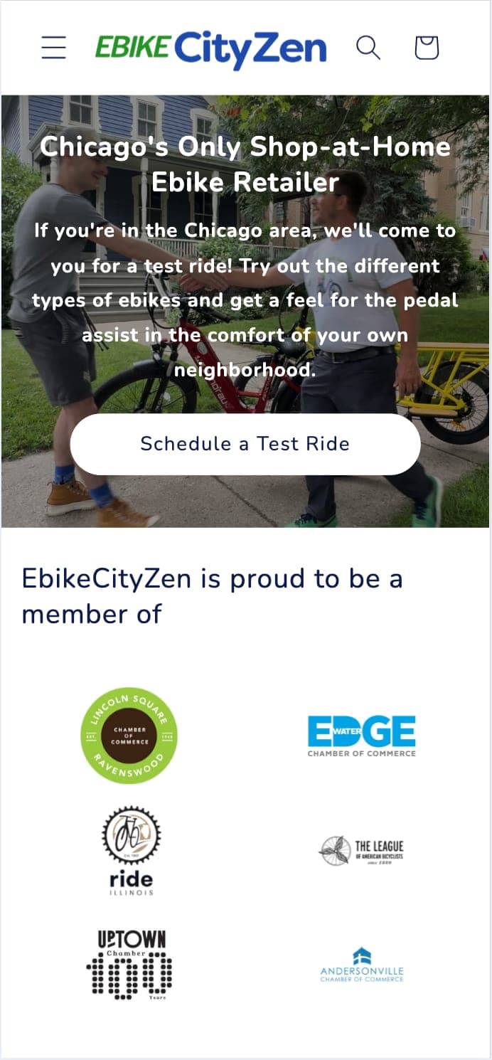
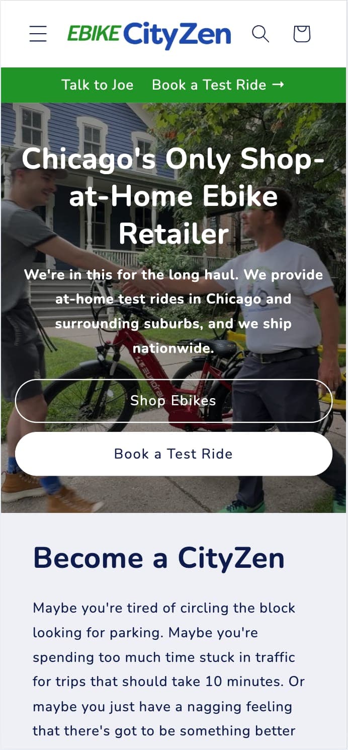
EbikeCityZen is a Chicago-based Ebike retailer with a unique sales model.
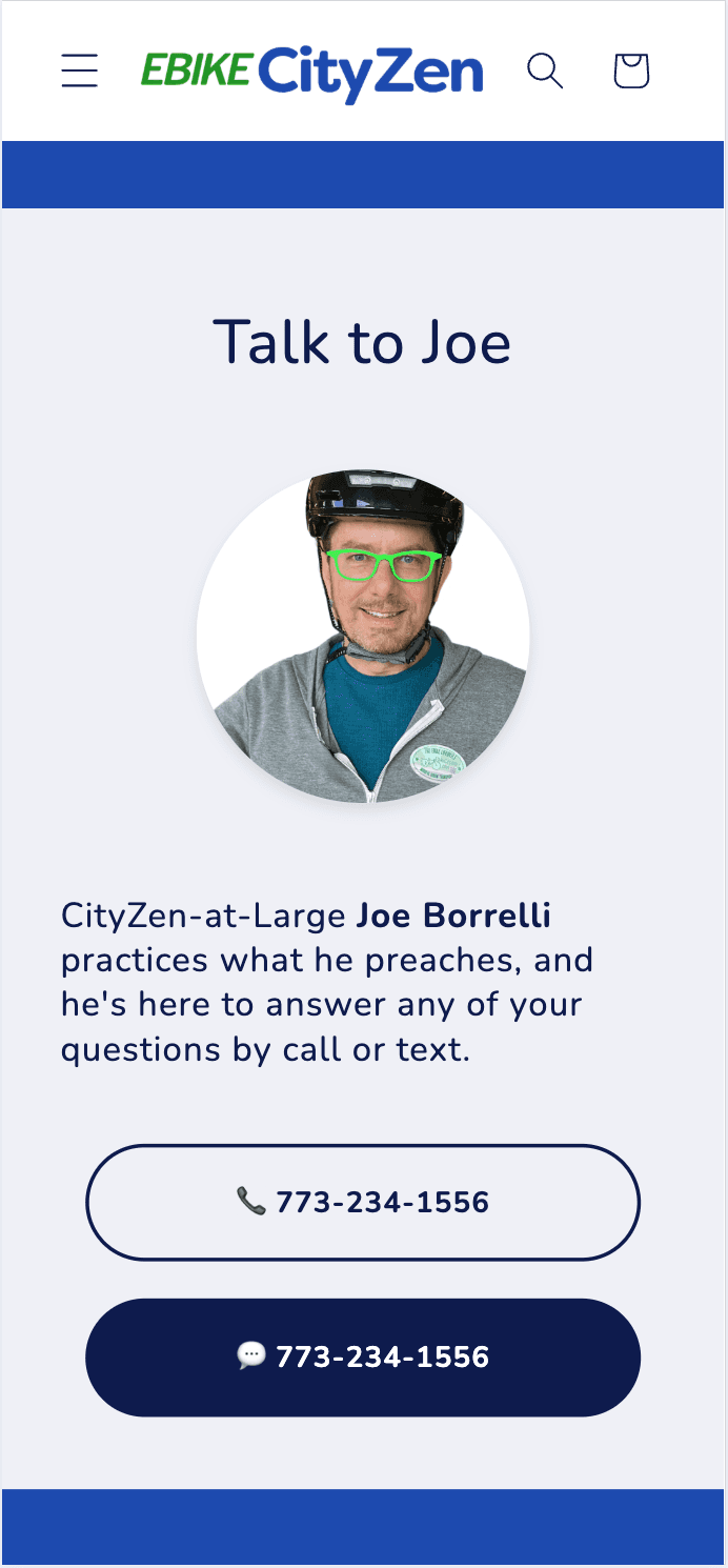
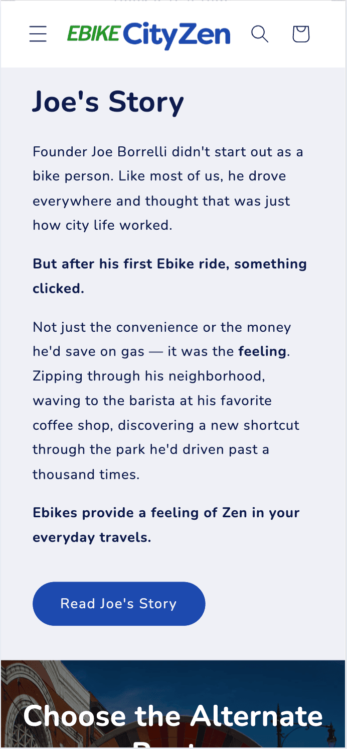
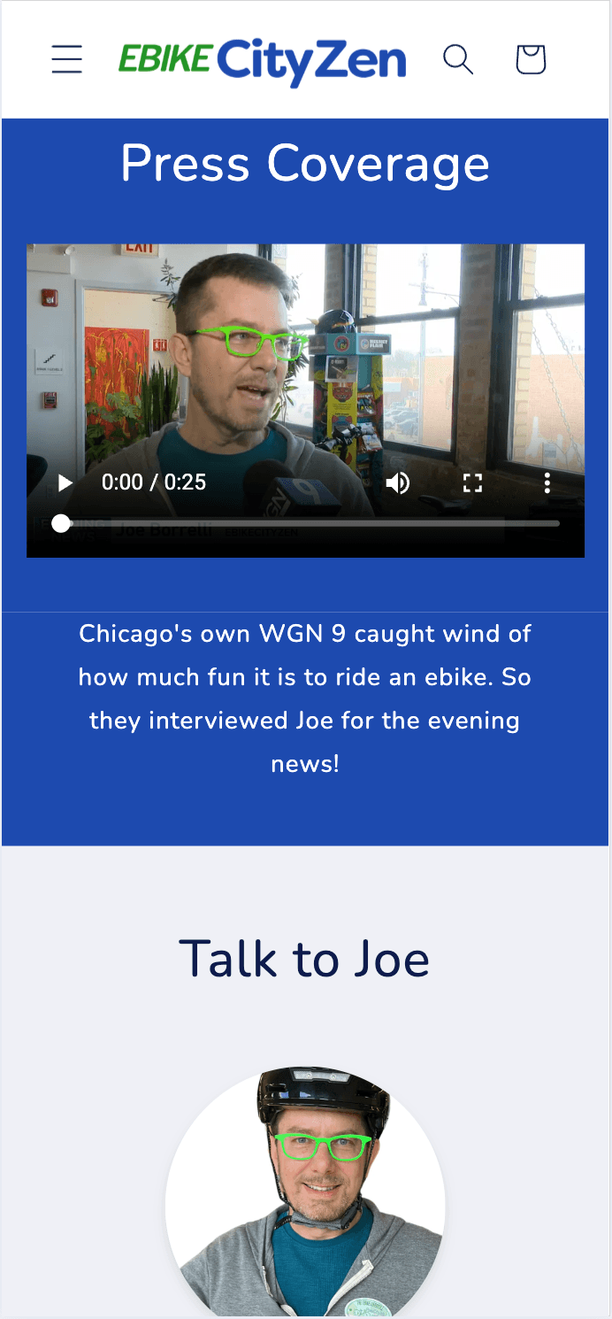
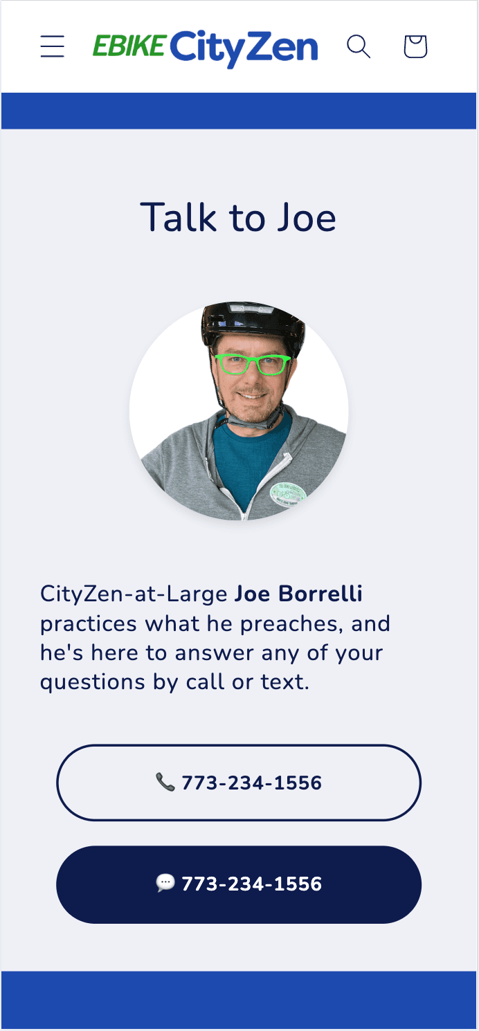
Founder Joe Borrelli operates without the overhead of a brick-and-mortar lease and delivers white-glove service to his customers with at-home test rides.
Our goals were to increase both test ride bookings and direct online sales.
The Challenge
Most urban car commuters don't even realize they have a problem, let alone that ebikes could be the solution. They just drive everywhere because it's the default choice.
Some potential customers get information overload from all different product categories and specifications. Others are intimidated by subcultures associated with other forms of cycling.
Strategic Messaging Framework
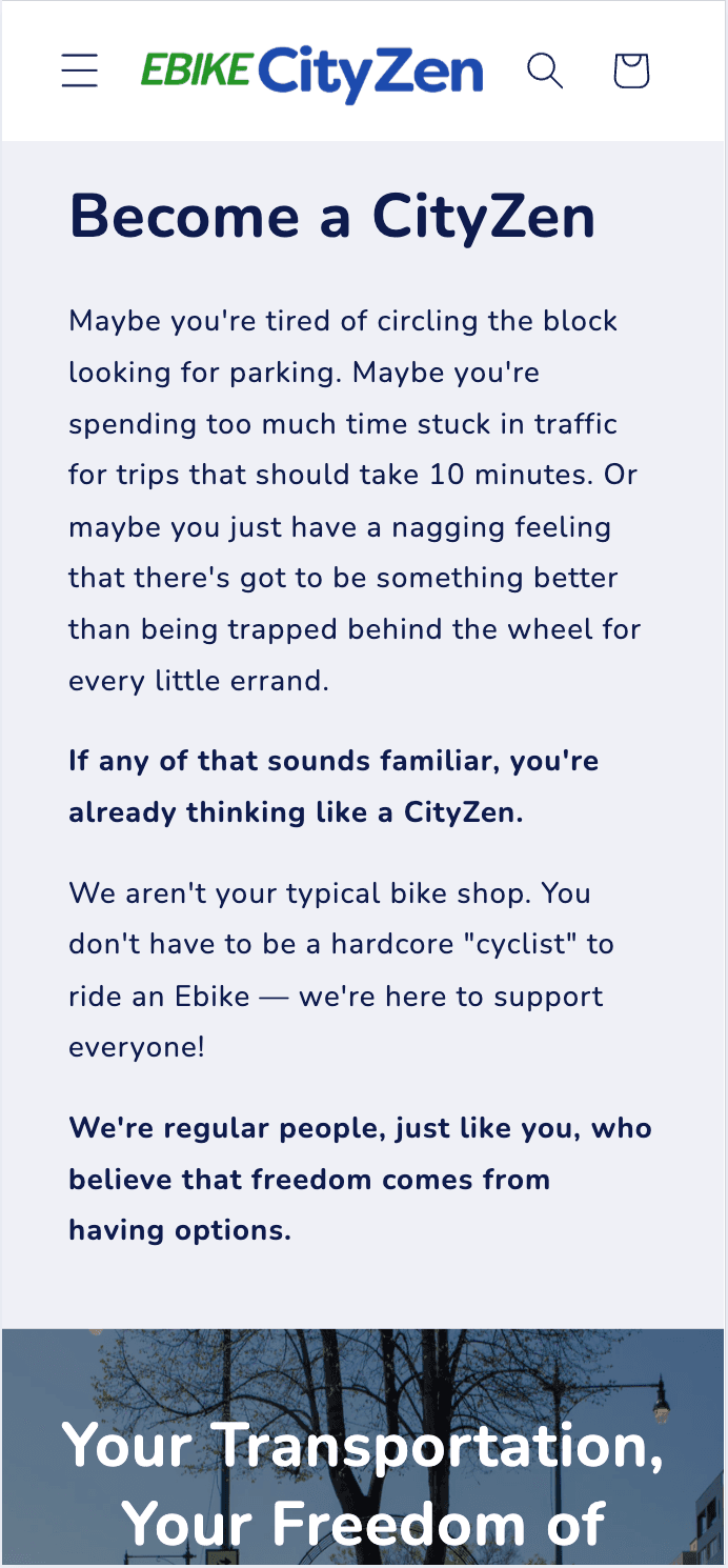
We addressed the psychological and emotional barriers that hold potential customers back from considering ebikes.

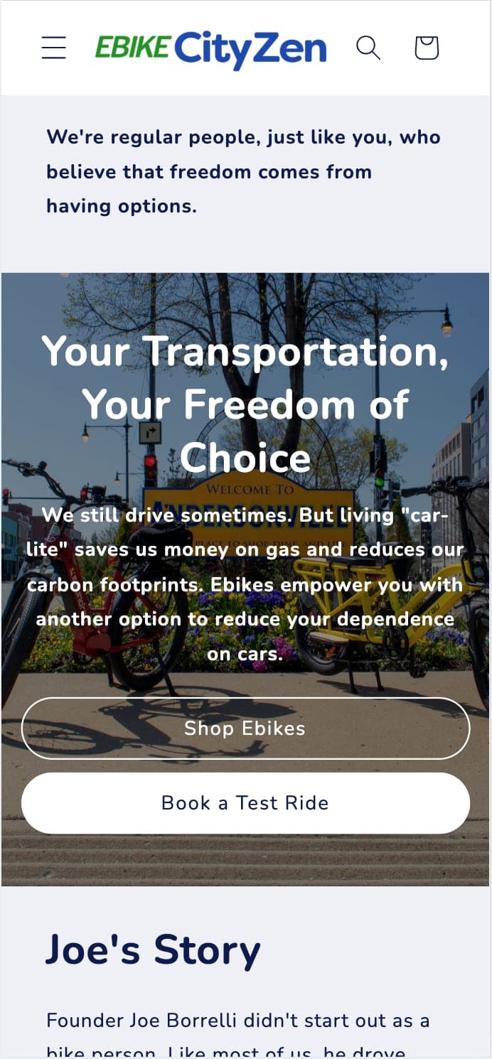
Pro-Choice, Not Anti-Car
We positioned Ebikes as an additional transportation option, not a replacement for all car use.

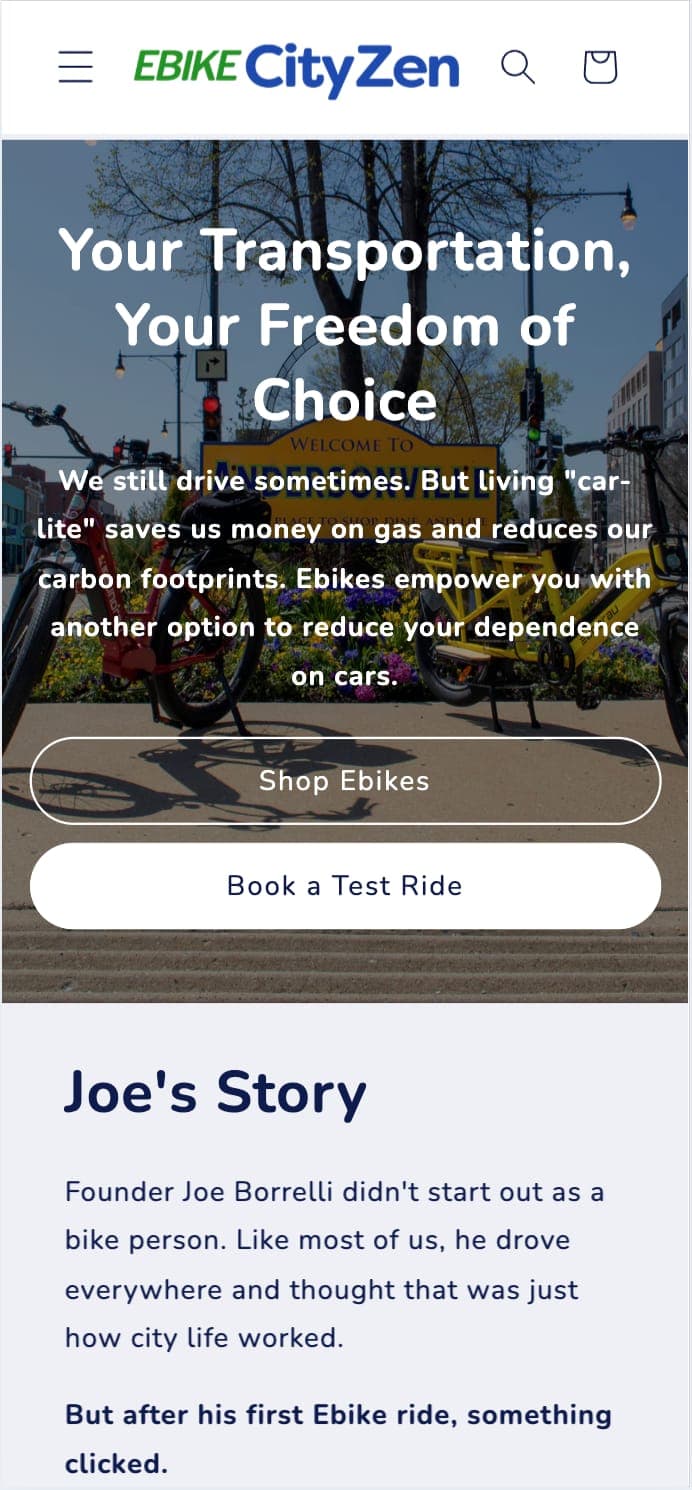
Tool for the Job
Framed the decision as using the right vehicle for the right distance, like choosing between a screwdriver and a hammer.

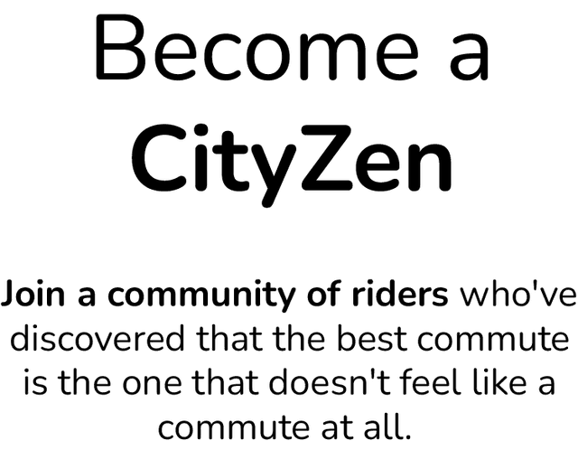
Community Over Isolation
Emphasized connection, spontaneity, and discovery over the illusion of control.
"True freedom means feeling connected to your community, not isolated from it."
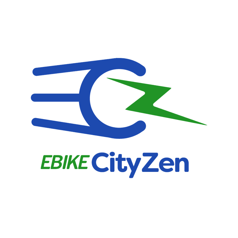
Brand Refresh — Logo Design


Logo Evolution: Updated the existing EbikeCityZen mark to suggest motion and a sense of community, while maintaining brand recognition.
Brand Refresh — Color Palette
FreedomTrustNew Experiences
Cobalt Blue
#1D4AAF
FreedomTrustNew Experiences
Forest Green
#219426

CommunityGrowthEnvironmental Consciousness
Color Psychology: We selected new shades of blue and green that represent the brand's core values more effectively.
Brand Refresh — Typography

Trade Gothic Next SR Pro
Bold

Filson Soft
Bold
Nunito
Variable Weight
Typography: We selected fonts that feel friendly and approachable, rather than technical, to reinforce the message that ebikes are for everyone.
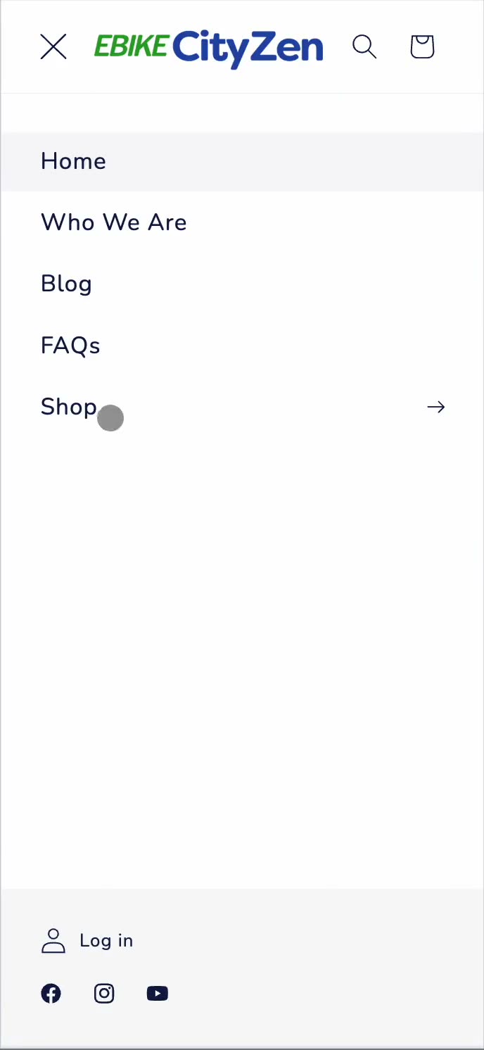
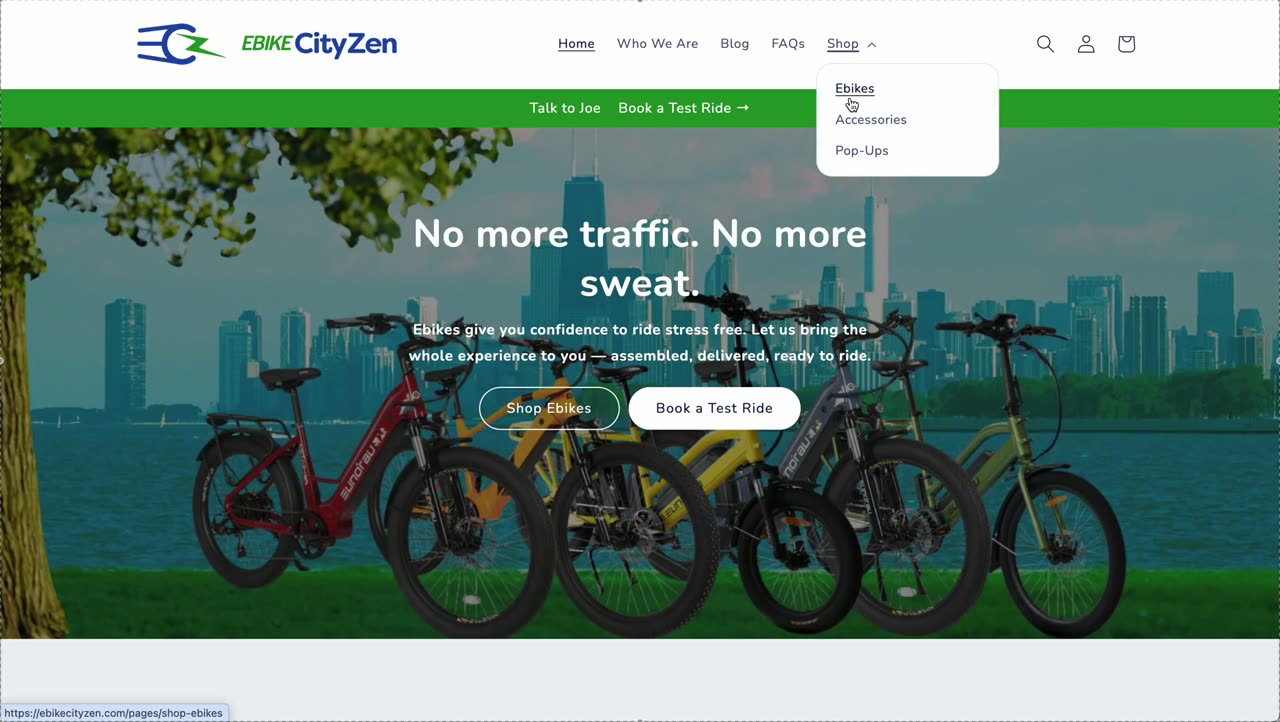
Diamond Lane Navigation
Desktop
Mobile
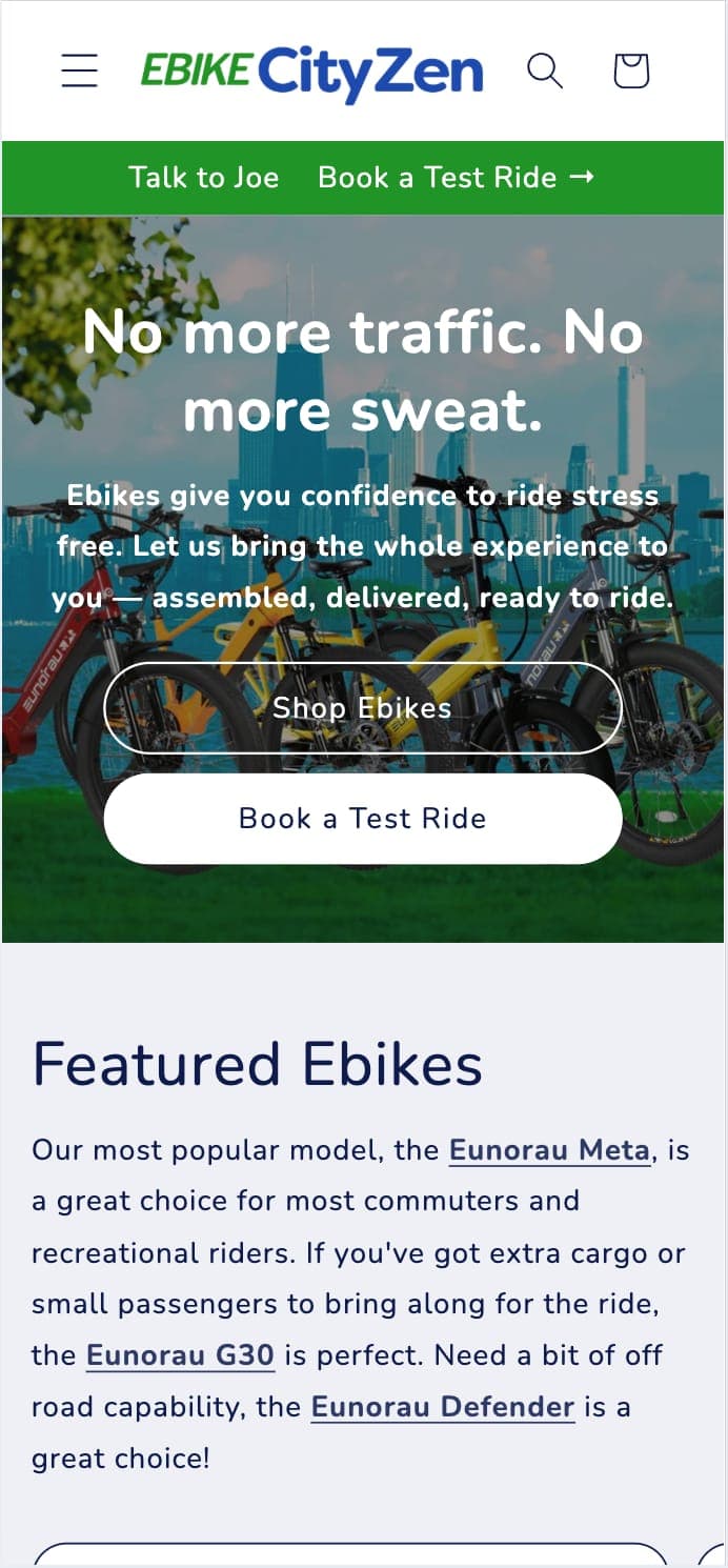
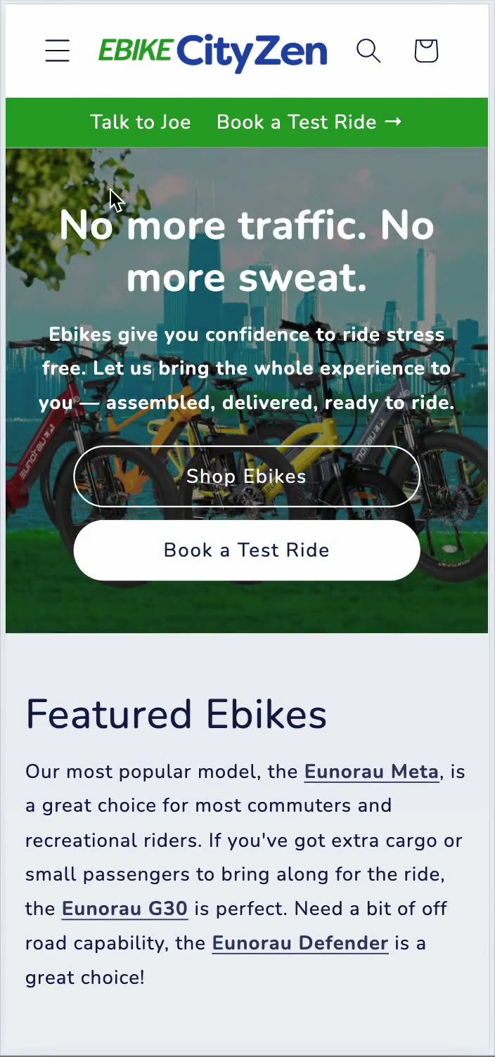
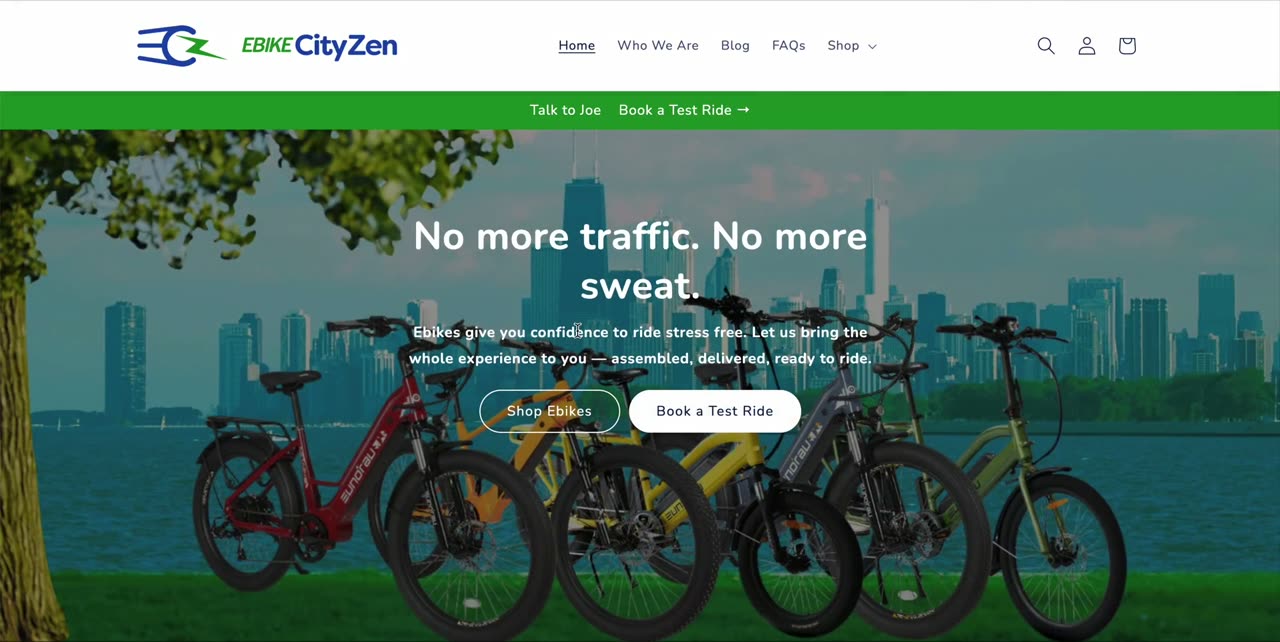
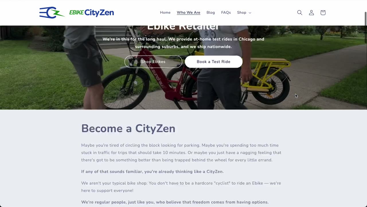
Homepage Overhaul
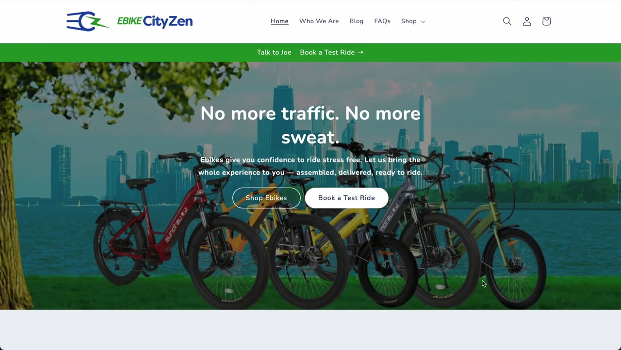
Desktop
Mobile
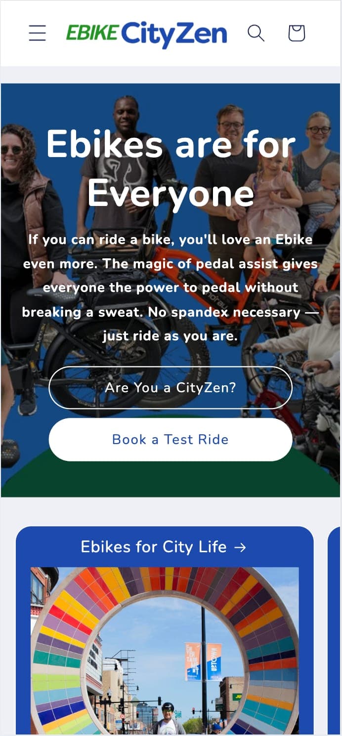
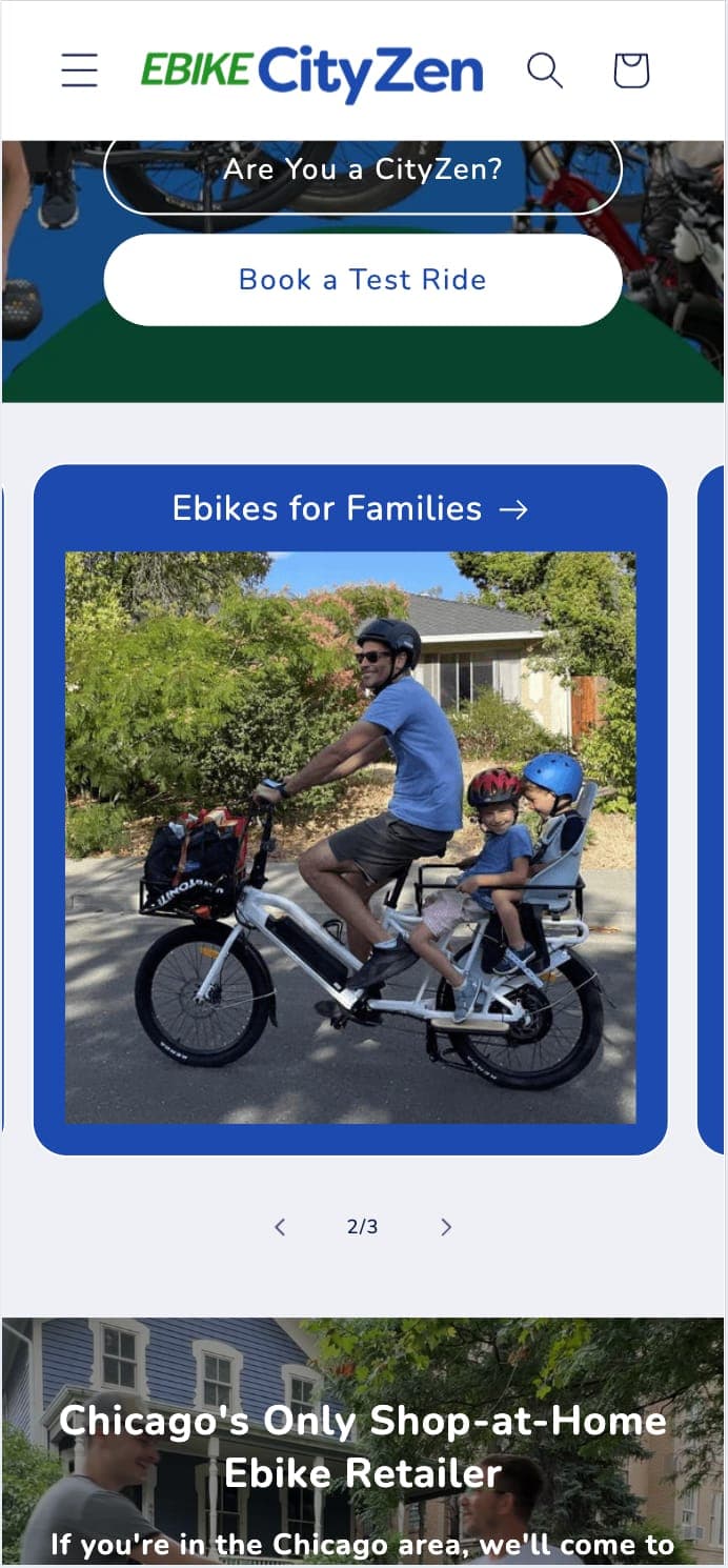
Inviting Shoppers Into the Community
Desktop
Mobile
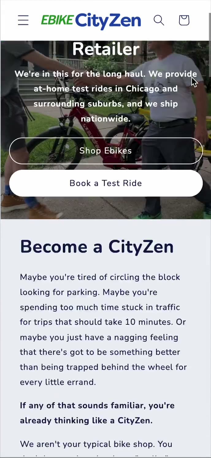
Hassle-Free Test Rides
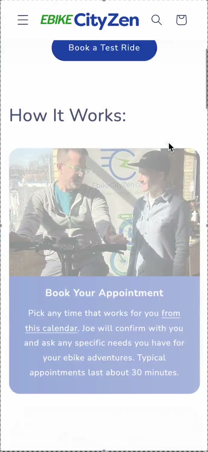
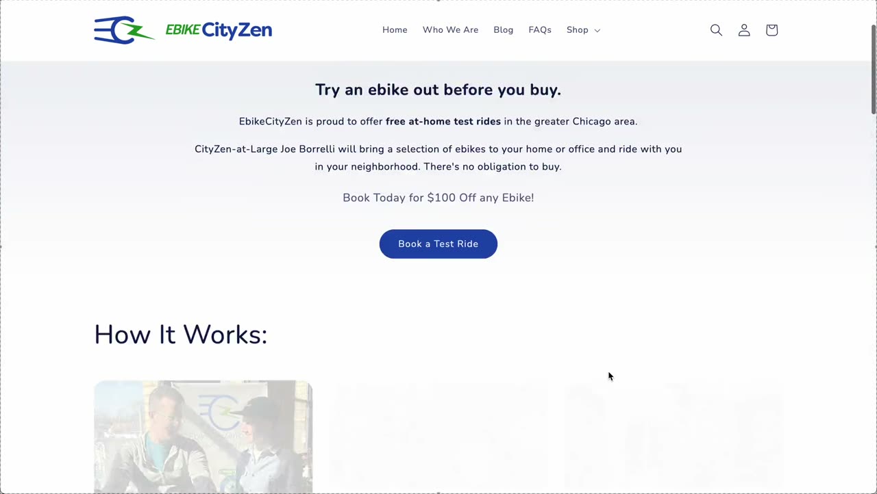
Desktop
Mobile
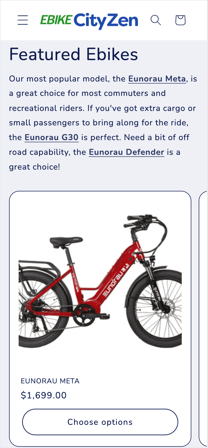
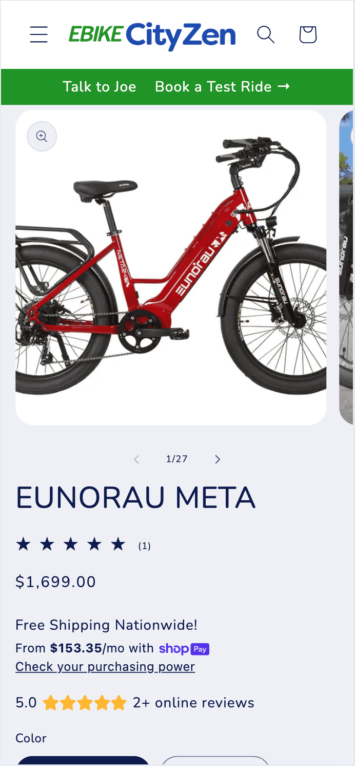
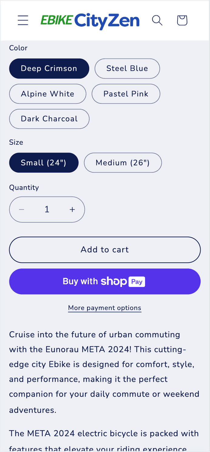
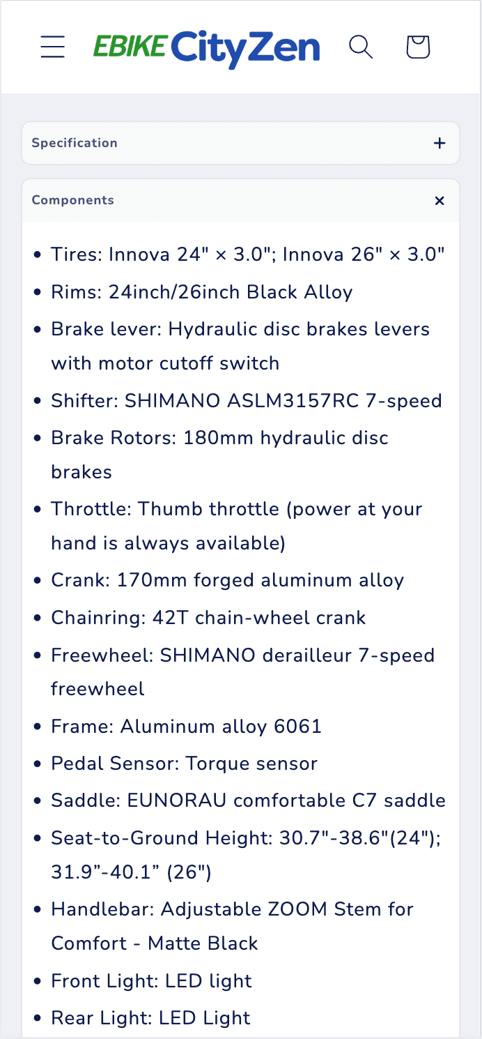
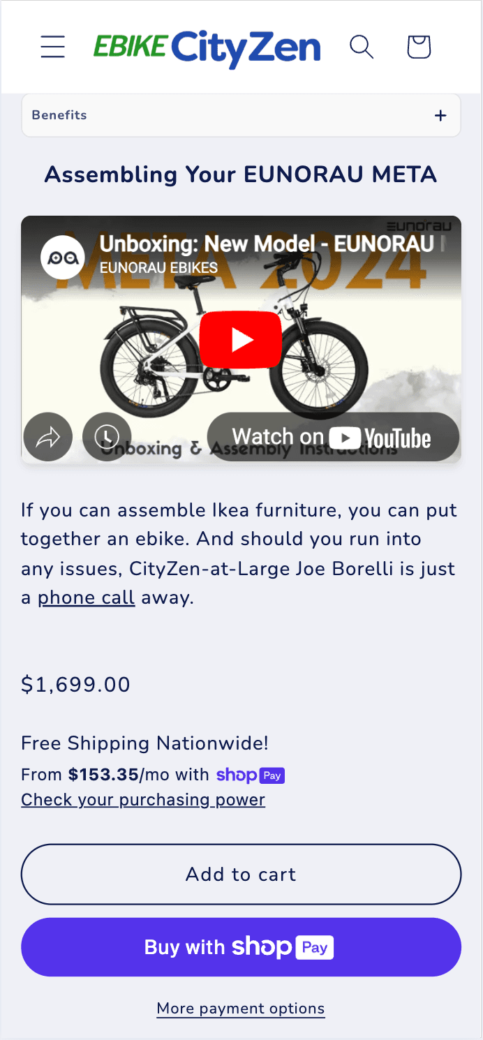
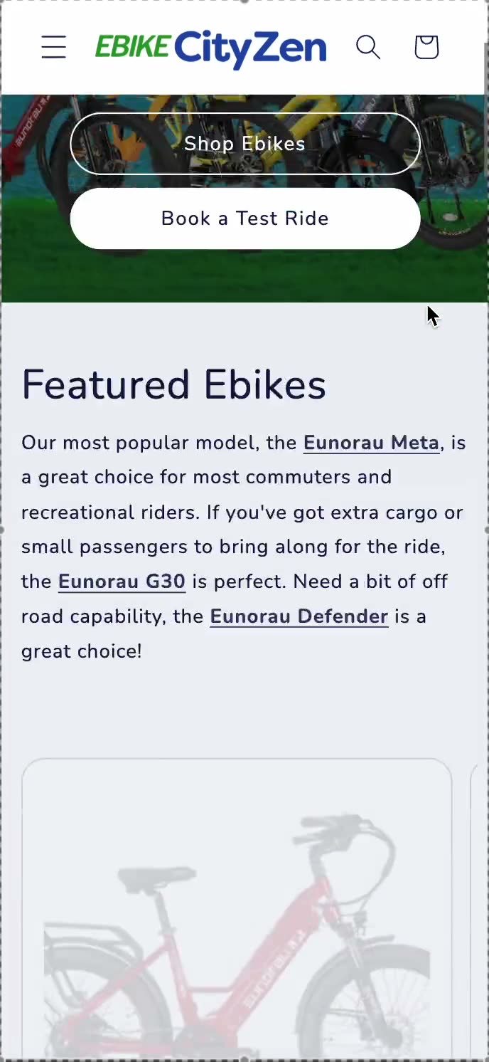
Enhanced Product Discovery
Desktop
Mobile
The Impact
+0%
Total Sales
+0%
Conversion Rate
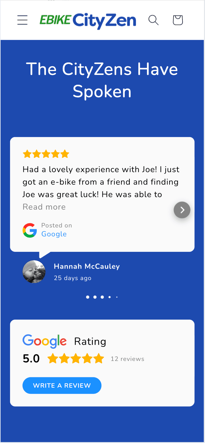
The redesigned website now mirrors the positive emotions customers experience during in-person test rides — freedom, joy, and community connection — rather than drowning them in product specifications.
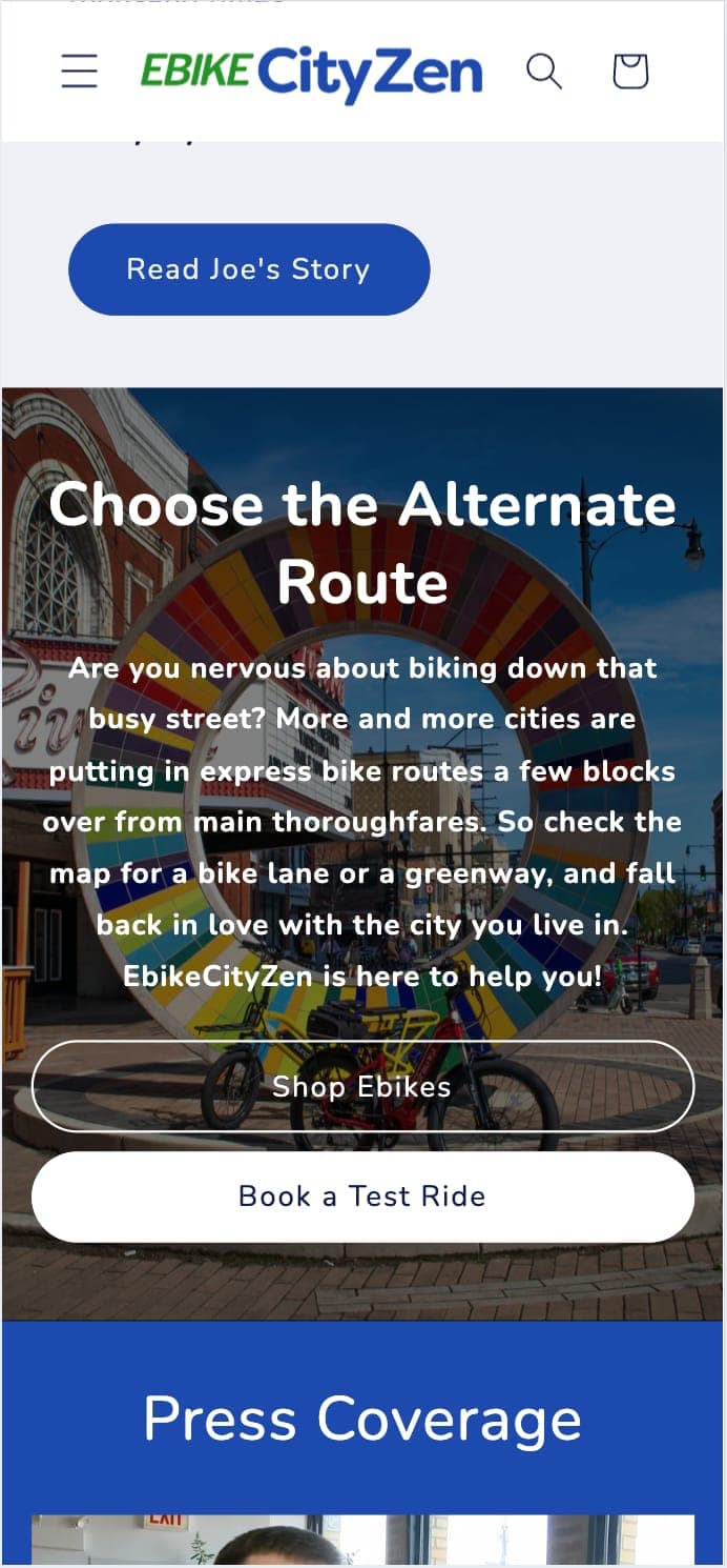
By creating a "diamond lane" to the most popular products and addressing identity anxieties around transportation choices, the new site guides visitors from problem-unaware to solution-ready.